Your Industry Is Not Too Boring for Video — Your Thinking Is.
A lot of B2B companies think their industry is too boring for video.

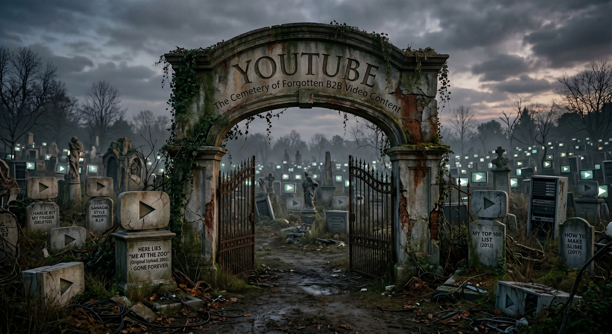
One-Off B2B Videos Are Killing Your Content's Potential
B2B companies love to finish content.

Your Experts Aren't "Bad On Video". Your Interviews Suck.
When B2B experts mess up on videos, the go-to explanation is:

Your Obsession With Your Company's LinkedIn Page Is A Problem
When social media underperforms for B2B companies, the instinct is to blame the platform. Algorithms change. Reach drops …

LinkedIn Thought Leadership Ads Are Your Ticket To Connecting To Your Market
Most B2B marketers approach paid social with a narrow objective: generate leads. Budget goes in, conversions are expecte …

Want To Ruin Your Video? Provide Interview Questions Ahead of Time
Somewhere in almost every expert video project, someone asks a very reasonable-sounding question: